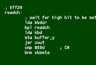
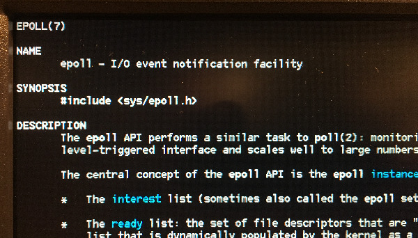
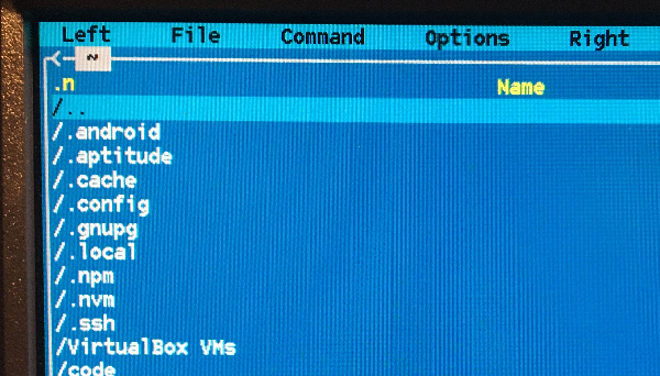
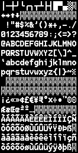
Bizcat is a retro 8x16 bitmap font, intended for hobby computers or terminals that use a 640x480 graphics mode, like the Linux VGA console. It supports most of Latin-9 and box-drawing glyphs. It’s available to use under the Creative Commons “share and adapt” license, so feel free to tweak it or use it in your own projects.
An image file in BMP format and a Linux console PSF file are available in the fonts/ folder of my font-problems toolset.
Why?
Retro-computing has received a new wave of interest over the past few years. It may be a reaction to the boggling complexity and fragility of modern systems: x86 boxes apparently require a separate CPU and OS just to bootstrap the real CPU, and once it’s running, it uses tricks so baroque that it took over a decade to figure out they were subtly flawed. It may also be due to the explosion of the “maker” community and the recent availability of simple hardware and components: you can build your own custom CPU from logic chips or assemble a motherboard for a new 8-bit platform.
Over the winter, I played around with the Commander X16 emulator, part of a project by David Murray (The 8-bit Guy) and his friends to create a new hackable 8-bit home computer in the style of the Commodore 64. The video output is 640x480 VGA, and by default it uses a blocky 8x8 font, maintaining the spirit of Commodore graphics while scaling up to allow a console of 80x60 characters. Unfortunately, while square letters are authentic, they clearly represent a limitation of the old graphics mode (which was only 320x200 or 40x25), not an aesthetic choice.
This made me think about how the old VGA PCs drew characters. With a wide-open 640x480 space, you can fit a standard 80x25 terminal by using a character cell size of 8x16, so that’s what they did. A 2:1 ratio sounds really tall for that era, but they used the extra vertical space to give more breathing room to accents and to pad out the line spacing. The result (check out this awesome collection of IBM fonts) looks really pretentious to me because of all the serifs. I think IBM chose a typewriter style to differentiate their “strictly business” PCs from the “fun time” look of their competitors. But now it’s fun time again.
I was immediately bitten by the bug. Time to draw a new bitmap font!
Since I was committed to spending my free time on this, I decided to make a few other philosophical changes. In the 1980s, you needed a 100-kilo CRT to view text. These days, you’re more likely to be looking at VGA graphics on a 7" flatscreen made from old tablet parts. So I decided to use thick lines that can be seen at high DPI. If all lines are two pixels wide, then 1-pixel offsets act as a kind of anti-aliasing to smooth out curves. And if curves look nice, let’s lean into them and make circles look as round as possible. Some fonts push circles in the direction of rounded rectangles, which gives a nice rectangular look overall, but to me, geometric looks more “fun”, and circles are very retro-80s.
I tested and iterated on the font by trying it out on the Commander X-16 emulator. The VERA video “chip” has two layers, and each can be assigned a different bitmap font, so I sliced the 8x16 font into two half-fonts, with each character’s top half on one layer and the bottom half on the other. Once I was satisfied, I realized I could also use this font on my physical Linux server console, after cleaning the spider webs off of it.
So jaunty! I think I’ll keep it.
If you make any significant changes, or if you use this font in any interesting places, I’d love to see them!
